We all keep hearing the same advice: Your flatlay needs a solid colour palette. But how the heck do you make that happen? How do you even start?
First, let’s cover why a solid colour palette will greatly improve your flatlay. When your image is a mish mash of whatever colours, it gets too messy to take in. When there’s harmony in your colour scheme, all the elements of your flatlay work together as a team and this makes it more impactful. Your images compete with hundreds, even thousands, of other images cluttering every social feed. In order to stop your target audience from scrolling past your flatlay, you need to wow them in a split second. Your flatlay needs impact. Your flatlay needs a strong colour palette.
Let’s Skip The Colour Theory
There are heaps of online resources devoted to colour theory. They get into the nitty gritty of the colour wheel, hues, tints, saturation, and a lot of other words that need defining. I’m not going to explain all that here because I don’t usually refer to the colour wheel when choosing colour schemes for my flatlays. Why? Because other people have already done that for me. In other words: I cheat.
The Trick To Finding Your Colour Palette
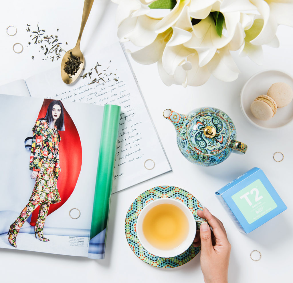
The trick to finding a great colour palette for your flatlay is that it’s already right in front of you. It’s probably staring you in the face. Usually, when you create a flatlay, you already have a purpose in mind. You have a hero product you want to showcase. It might be a shirt, a tube of lipstick or a cup of tea. Whatever it is, it’s likely that you didn’t design it because someone else did (unless of course you did, in which case props to ya!). That someone else probably studied colour theory. Is your tea cup a harmonious green, blue, and yellow? Well abracadabra! That’s your flatlay’s colour palette. Your colour palette can be found in the hero product you plan to shoot.

Adding Black Or White
Sometimes your hero product has a simple colour scheme. Maybe it’s just one colour. Let’s pick the colour red. You can do a killer flatlay using only red objects. But maybe you don’t have many props that are red. Black and white are neutral shades that literally go with every colour of the rainbow. In fact, a large chunk of my props are black or white because they are so versatile. All in doubt, you can make your colour palette a colour plus black, or a colour plus white, or a colour plus black and white.
That Ol’ Magazine Trick
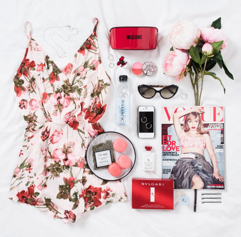
Ever wonder what to do with your growing stack of magazines? They are a treasure trove of flatlay props. My favourite trick for flatlays is to use a colour palette that already exists on a magazine cover or fashion spread. Professional designers and creative directors are professional for a reason: they know what the heck they’re doing – especially with colour schemes. The bonus with adding a magazine image in your flatlay is that it adds to the mood and story of your overall image. So hang on to your old magazines and go buy some more – they’ve now become a necessity!

The magazine cover has both a strong colour palette that is extended to the rest of the flatlay and the image itself adds to the overall mood and feeling.
Use Only One Metallic Colour
Gold and silver details are found in a lot of fashion accessories so they’re bound to make it into many of your colour schemes. Jewellery makes for great little finishing touches in your flatlay and I’m guilty of including little rings and bracelets in almost all of mine to fill up the last little gaps in my composition. I don’t always stick to this particular rule about metallics, but if colour palettes aren’t your forte, stick to one metallic shade per palette until you build your confidence in this department. Only include silver or gold or rose gold accessories.
Always Tie It Back In
No matter how you style your flatlay, if you add a prop that introduces a new colour to your colour palette, be sure to tie that colour back into the flatlay by adding another prop or two that is that same colour. One red object will stand out (which might be what you want), but styled among 2 or 3 other red objects, the red will blend into the whole composition. Remember: balance is key when styling a flatlay. Using a defined colour palette will bring harmony to your composition and give your flatlay maximum impact.
- C xx


Great post! Thank you for the helpful tips!!
Thank YOU for the kind message. So glad to be helpful.
I love the simple yet impactful idea of adding magazines, I let them stack all over my house without a thought… but not anymore- they are back to work! Ha! Thank you for sharing your knowledge!
Hi Tori, I totally love how my old magazines are no longer uselessly taking up space. They can be used again and again for inspiration and props. So happy to share these tips. Thanks for you kind message x
Thank you so much for the helpful tips! 🙂 You helped put everything in perspective for me as a fashion blogger. It seems similar to creating an outfit, just play off of different colors while keeping it tied in. <3
-Kendall
Hi Kendall, yes that’s exactly how I see it – like creating an outfit. I’m so glad you found this post helpful. Thanks for your comment x