Flatlays are a popular way to tell a story with great visual impact. They can be jam packed with gorgeous details yet be small enough to shoot in the comfort of your home. They are so popular that a whole host of resources have popped up in the last couple of years teaching people how to flatlay like a pro (including this blog!). But a lot of those resources miss the nuance of why a flatlay jumps off your screen so their advice is sometimes off the mark.
Styling plays a large role in the success of a flatlay, but relying too heavily on this aspect will only take you so far in the flatlay game. Remember that first and foremost, a photo of a flatlay is a photo. That means that this isn’t about styling. This is about photography.
Think Like A Photographer
The biggest mistake I see content creators make is forgetting that this is about photography. Photos are 2-dimensional in nature, but humans see the world in 3-dimensions. It’s your job as a photographer to make photos look 3-dimensional. Images need depth to feel real and create interest. The surprising secret to great flatlays? Flatlays should not be flat.
How To Create Depth In Your Flatlay
Now that we’re back to thinking like photographers, I will of course share with you a few of my favourite photography tricks for creating depth in my flatlays. For even better results, try using them in combination.
Flatlay Tip 1: Create Volume with Light
Do you ever look at a flatlay and feel that it lacks umph? It’s often because the lighting is flat. The term ‘flatlay’ refers to the objects in your scene lying flat on a surface. This doesn’t mean it’s okay to let your lighting fall flat too.
So what is flat lighting? Flat lighting is when the light fails to create a sense of volume for your objects. Volume, after all, is a 3-dimensional concept. Flat lighting is when your highlights are dull and your shadows feel non-existent. The worst advice I read on flatlay advice blogs is to obliterate your shadows. That’s a terrible idea! Lighten your shadows if you like, but please don’t obliterate them completely. Shadows and highlights are what create volume and texture for the objects in your image. No shadows and highlights? Then no volume, texture or depth. Just flat.
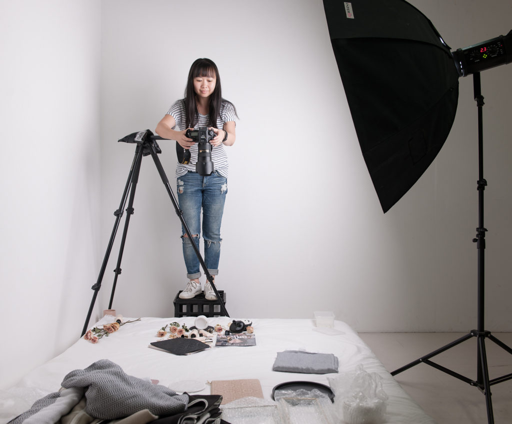
The way to create shadows and highlights is to place your light source at an angle to your flatlay and not directly above (ie: where the camera is). A general rule of thumb is to never place your light source next to your camera. Doing this makes all the shadows go behind or under your objects and out of sight of your lens. What you want is for your light to skim across your flatlay and not hit it smack from above. Window light is great for this because windows are often at a right angle to your flatlay and not directly above where your camera ought to be.

Flatlay Tip 2: Play With Distances
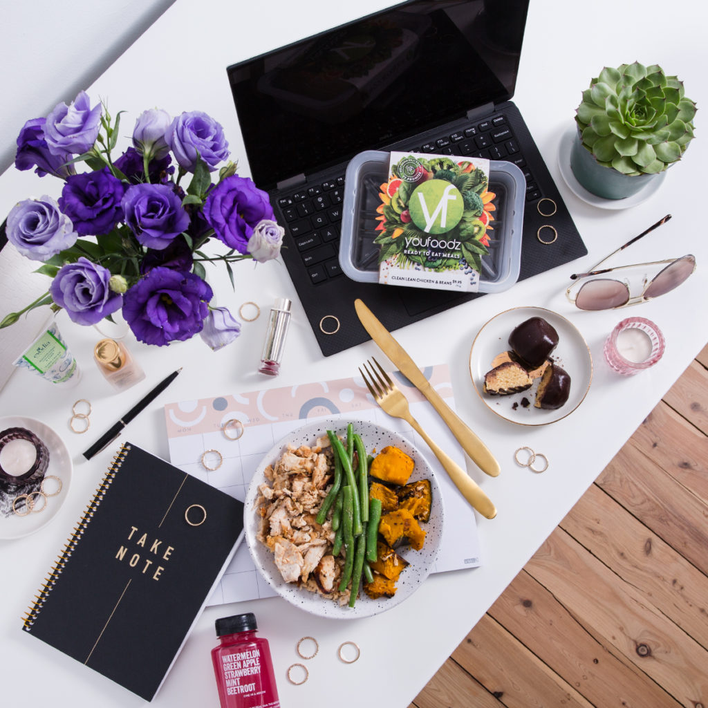
Placing objects closer or farther from your camera will add depth by creating a sense of the distances within your photo. Instead of lying everything flat in your flatlay, try placing some of your objects standing up. Bottles, vases full of flowers, and open laptops are great ways to create height. Also the taller the object, the bigger the shadow it will cast making Tip #1 ever easier to accomplish.
Showing the edge of your table or bed to reveal the floor below is another fun way to play with distances. Maybe there’s a chair next to your desk or a pair of shoes on the floor next to your bed. Creating levels in your flatlay is a wonderful way to add depth while offering more creative opportunities to add details to your story.

Play with height and depth in your flatlays
Flatlay Tip 3: Shoot Your Flatlay At An Angle
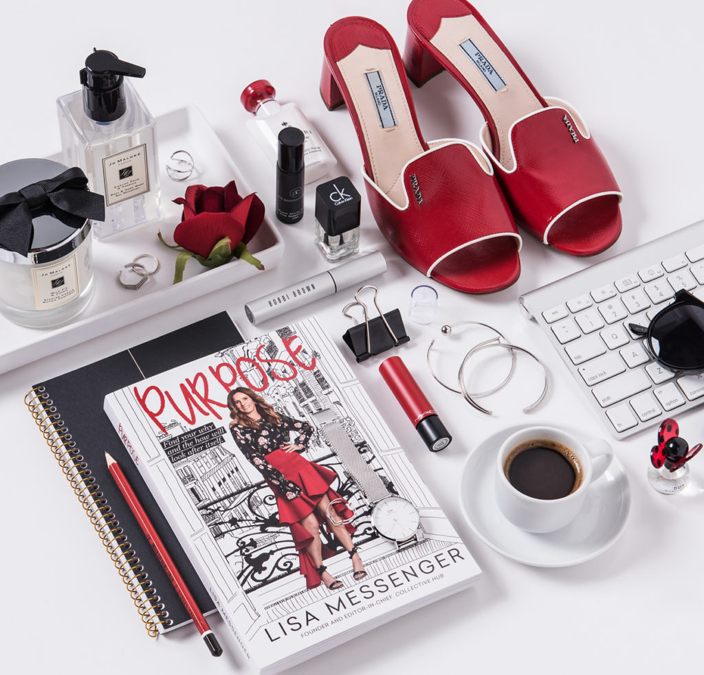
We often describe flatlays as objects shot from a bird’s eye view. But all creative rules can (and should) be broken. Shooting your flatlay from a different angle reveals the sides of your objects to your camera. More sides imply 3-dimensions and volume. This technique also plays with distance because shooting from an angle means that some parts of your flatlay will be closer to your camera than others. Emphasising volume and distance create more depth making your flatlay anything but flat.

Try shooting your flatlay at an angle to add more depth
It’s All About The Light
When it comes down to it, great lighting will be the main reason your flatlay will go from average to amazing. If you’re going to practice any of the tips above, my advice would be to concentrate on the first one the most. Lighting is everything in photography, and when it comes to social media, the quality of your visual content is king.
- C xx


This was very helpful to me. I am a writer with my own blog and creating photo content can be such a Hassel sometimes but I absolutely love doing it. I have wanted to try some of these tips before but I was scared of doing it wrong. Thanks for sharing this informative piece.
Hi! I’m so pleased that you found my blog helpful. I hope they encourage you to get out there and shoot more photo content. Don’t worry about getting things wrong. It’s art so there’s really no such thing as wrong. Just start. The more practice you get, the better you’ll become, and the more confident you’ll be in your skills. Good luck xx