Photography is all about storytelling. It’s like a movie told in one frame. As the photographer, you are the director, producer, cinematographer, art director, writer and editor all in one. And if your image is a movie, then your hero product is its shining star.
Your Job As A Photographer
As a photographer, it’s your job to make people see what you want them to see. The way you light, style and compose your image will have a direct impact on what part of your photo grabs the attention of your audience first. You only have a split second to stop those thumbs from scrolling past your image, so make sure your hero grabs their attention in that first split second.
As a content creator, you have the added responsibility of telling the story that your client wants to share. It’s what makes you more than just a creative, but a professional as well. With so many pretty props and background choices, it’s easy to go overboard on the styling and lose sight of your hero in all the clutter. To prevent that from happening, read below for my list of 7 ways to make sure your hero is the star of your photo.
#1 Depth of Field
Using a shallow depth of field is one of the oldest and best tricks for making your hero stand out in any photo. This is when your hero is nicely in focus, but objects in the background and foreground are really blurry.
To get this effect, you need to shoot with a wide aperture. Your aperture is how wide your lens opens up when you take a picture. This is when switching to manual on your camera really comes in handy. For a wide aperture, try shooting at f-3.5 or wider. Basically, the lower number your f-stop, the wider your aperture, and thus the shallower your depth of field. This effect gets amplified the longer the lens you use.
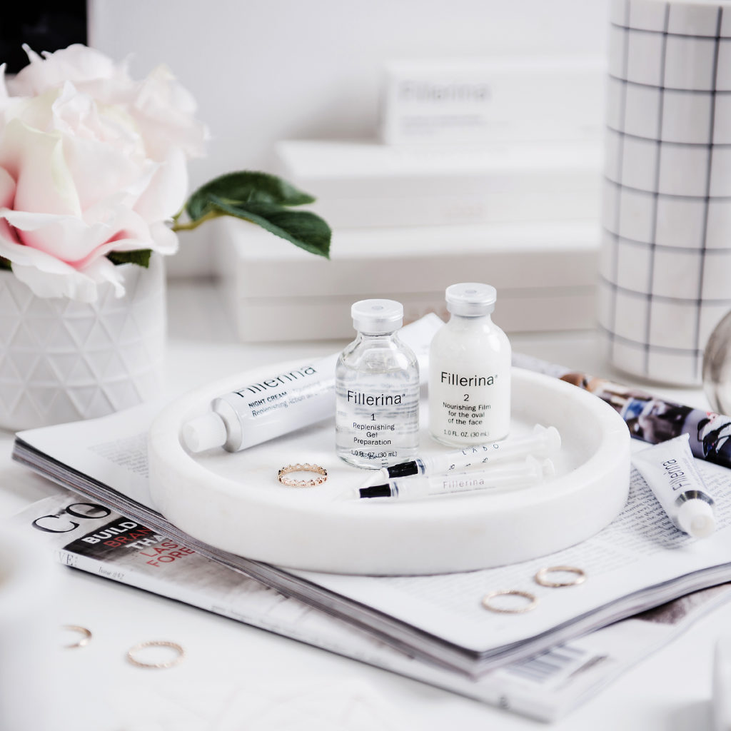
A shallow depth of field draws the eyes directly to what’s in focus
#2 Centre Stage
All in doubt, place your hero smack in the middle of your frame. Make sure it stays front and centre and doesn’t get lost behind any props you add to your image. This makes it easy for your audience to find your hero and leaves no doubt in their mind what your story is all about.

Make your hero the centre of attention by putting it in the middle of the frame
#3 In The Spotlight
Our brains are hardwired to look for the light. We can’t help it. It’s the secret that photographers, graphic artists and all visual creatives learn: People always look at the brightest part of your image first. So place your hero in the brightest part of your frame. See that gorgeous ray of light streaming through the window? Put your hero in it. Your viewers will look immediately at your hero because you’re literally shining a bright light on it. I guarantee it.
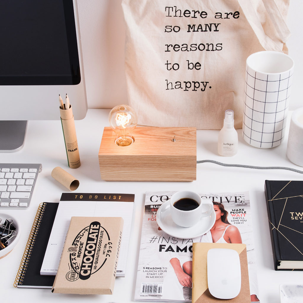
Eyes are always drawn to the brightest part of an image
#4 Areas of Contrast
Just as our brains are wired to look for light, our eyes are also drawn to areas of contrast. Place your hero in a setting where it will jump out from the background. Place dark objects on light backgrounds and vice versa. Got a pink hero, but also want to use a pink background? Put a navy blue notebook under your hero to add that pop of contrast and you’re good to go.

Areas of contrast always attract attention
#5 Colour Cues
Some colours naturally draw more attention than others. Think fire engine red, hot pink, or bright orange. If your hero is one of these colours, then you’re laughing. If not, consider omitting props that are those attention seeking colours. You wouldn’t want a supporting character to steal the limelight from your star.
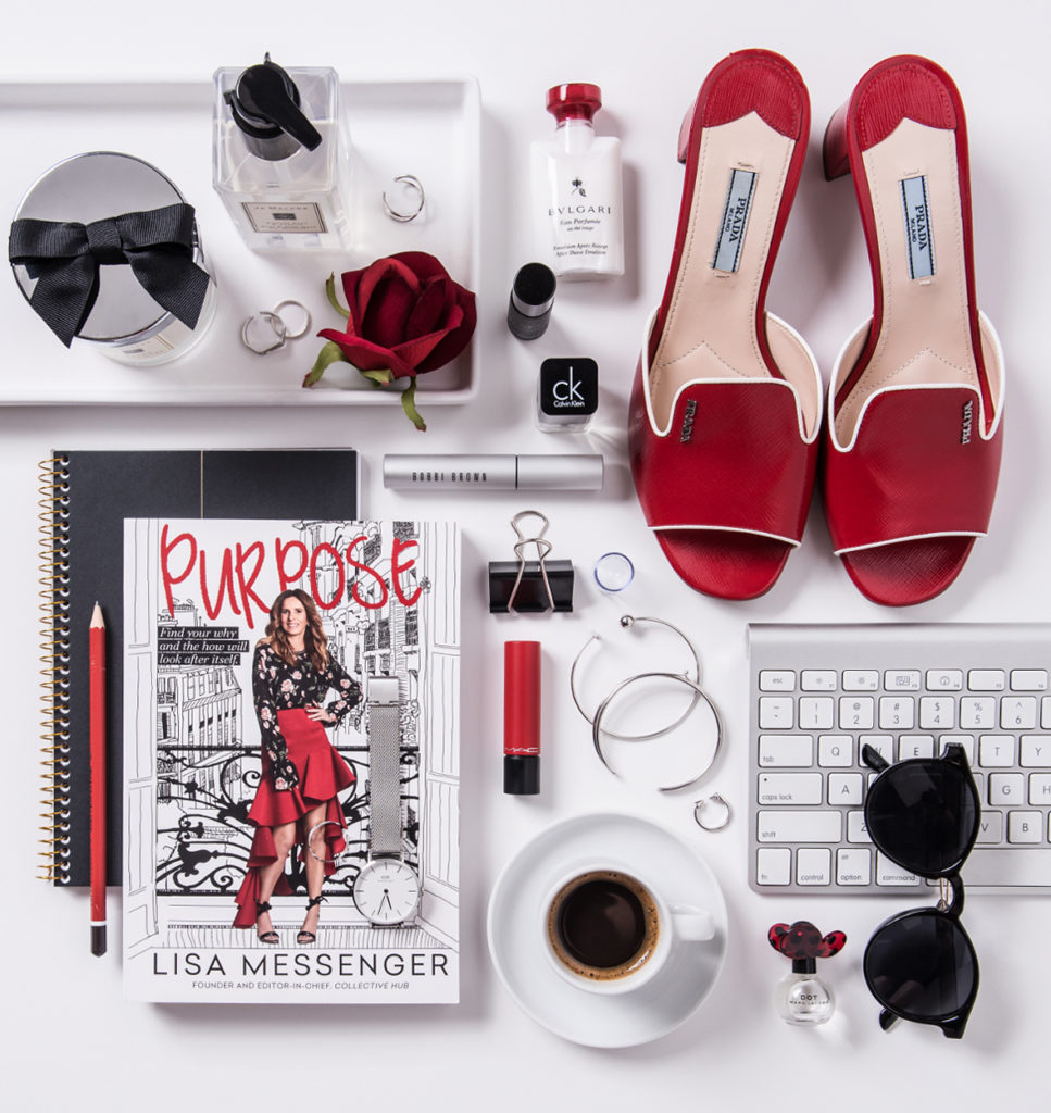
Red is a favourite attention-grabbing colour.
#6 Leading Lines
Lines in your photo are like little roads for wandering eyes to follow. Lines occur everywhere: the edge of a table or book, shoelaces left undone, pens, lipstick tubes, utensils, even a pointed finger. Always pay attention to where the strongest lines in your image are pointing. If you can, point them directly at your hero. If you can’t, then point them to a corner of your frame. Lines that point to your corners create triangle shapes which makes a stronger composition.
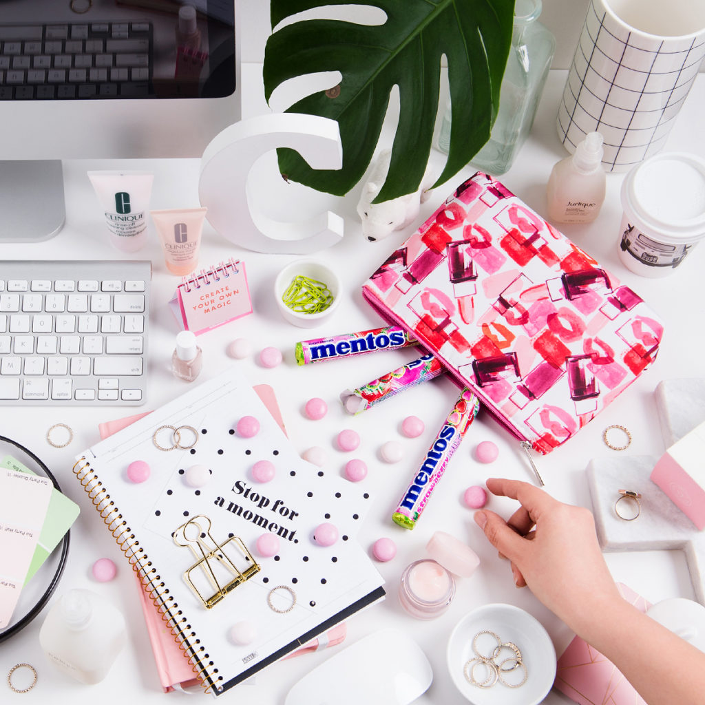
Leading lines are little paths eyes love to follow
#7 Disrupting Patterns
Who doesn’t love a good pattern? We all do, which is why our eyes have a knack for pinpointing the exact place a pattern gets disrupted. Use that to your advantage in your compositions by placing your hero in such a way that it breaks a pattern.
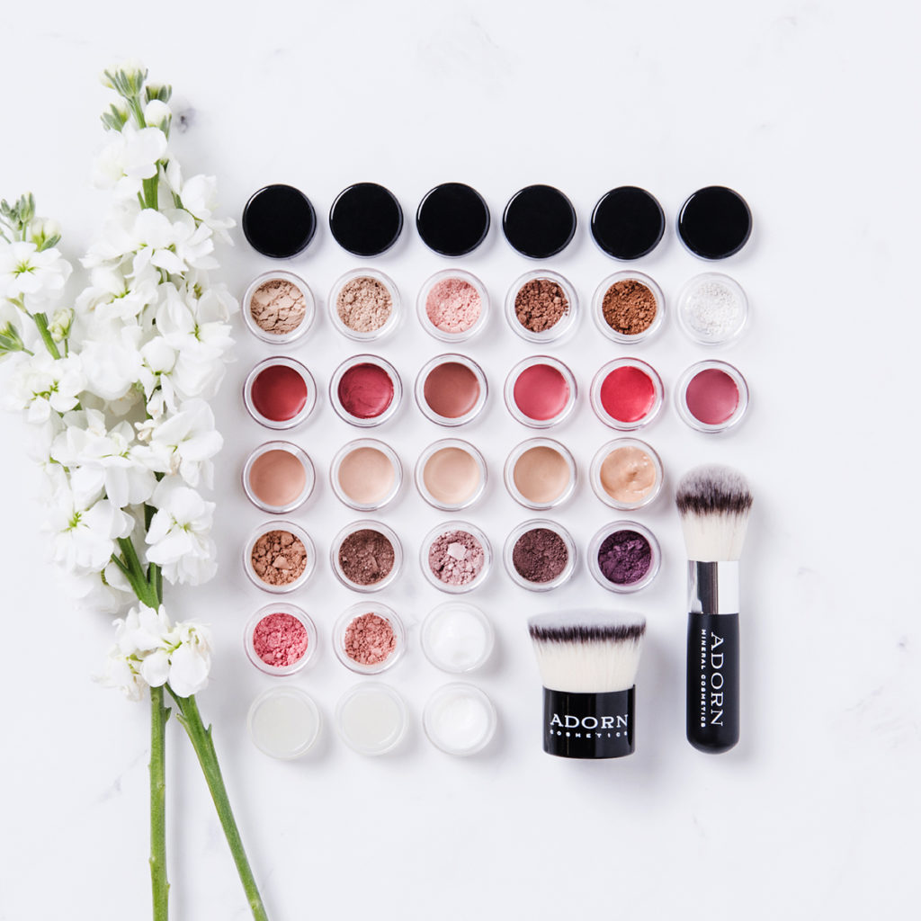
Disrupting a pattern is a great way to get your hero noticed
The Bottom Line
No matter how you make it happen, your hero needs to be the star of your photo, especially if you’re creating content for a client. Knowing how to compose your image to make your hero shine will ensure that your audience is actually absorbing the story you’re telling them, which is the whole purpose behind every photo we create in the first place.
- C xx
Note: This blog is in collaboration with Vamp and first appeared on vampcollective.com


We аbѕolutely love your blog and find a lot of your post’s to be exactly I’m looking for.
Do you offer guest writers to write content for you? I wouldn’t mind comρosing a post or
elaborating on most of the subjects you write relatеd to here.
Again, awesome site!
Thanks for reading my blog and for the offer of help. At the moment I’m not looking for more guest writers x