You’re seeing them everywhere. Flatlays are highly engaging Instagram content and you’re wondering if this is something you could be creating too. So how do you start? Or maybe you’ve tried to shoot a few flatlays, but they just weren’t coming together and you don’t know what went wrong.
I’ve got good news for you friends: making great flatlays is easier than you think. It’s actually a lot of fun and who doesn’t want more of that? Today I’m sharing my steps to creating the flatlays you see on my account @whatshepictures that I get paid to create for brands in my photography business. Keep reading to learn my 8 steps to making engaging flatlays.
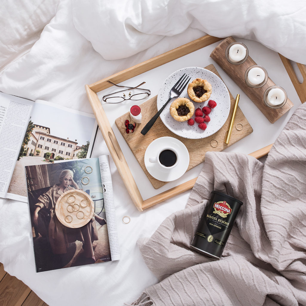
Flatlay shot for Moccona Coffee
Step 1: Know The Why Behind Your Flatlays
Strong flatlays always start with being clear on your why. What are you trying to accomplish with your flatlay? Are you sharing a new product? Are you showing how your service or product can fit into your customer’s life? What’s the story you’re sharing with your flatlay? Your why is the foundation of your flatlay and all the decisions you make when creating it should be based on your why.
Step 2: Choose A Clean Background
Clean, uncluttered backgrounds are the best and easiest way to give your flatlay more impact. Avoid busy patterns or bold coloured backgrounds because they’re distracting and compete with the objects in your flatlay.
You probably already have tons of great background options lying around your home. White bed sheets, wood tables, neutral coloured floors, and marble countertops are popular because they’re clean and readily available. Light coloured craft paper from your local office supply shop is another easy background idea. The key is to choose a background that can act as a blank canvas.
Step 3: Light Your Flatlay
Natural light is the best way to light your flatlays when you’re starting out. It’s free and available everywhere. The best natural light is next to a window on the shady side of your house or outside in the shade. The key is to avoid direct rays of sunshine so you don’t get harsh shadows and extreme contrast in your image.
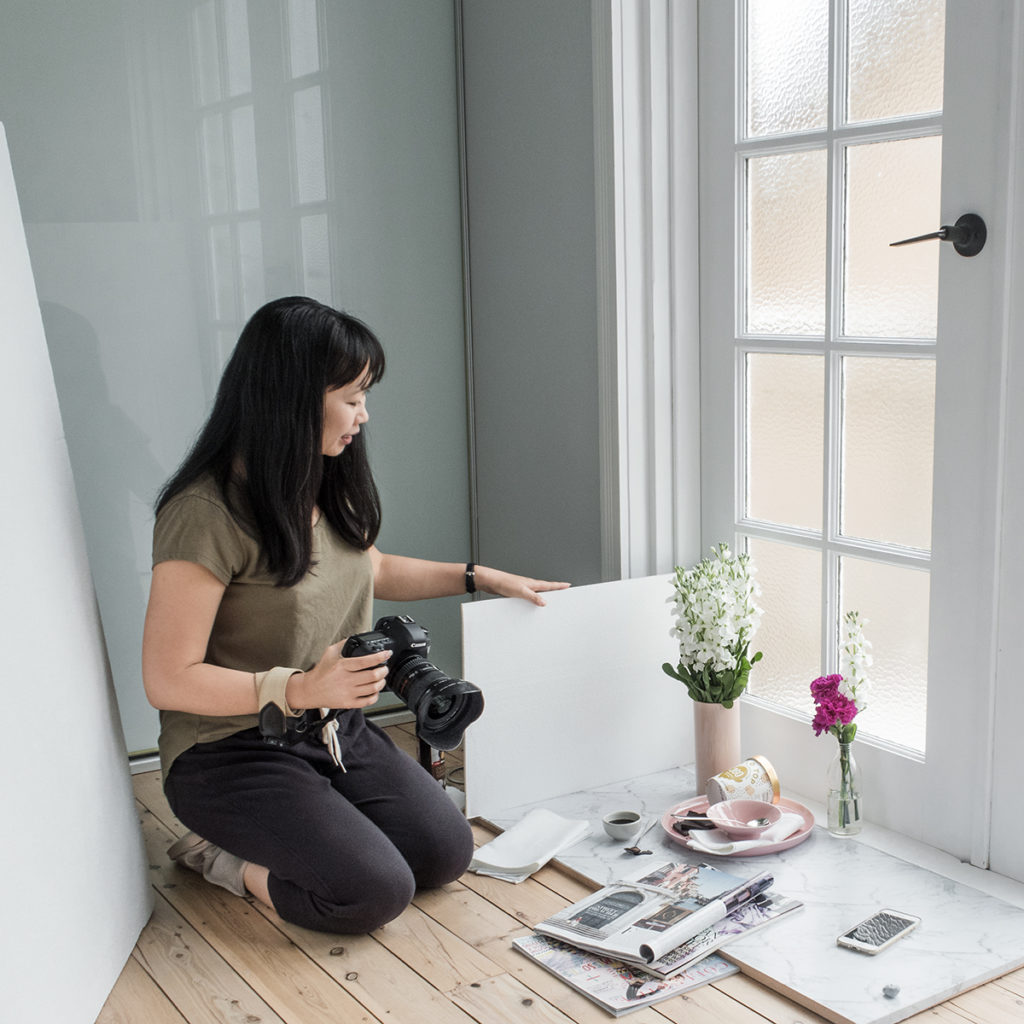
Window light works great for flatlay photography
Step 4: Place Your Hero Product
Most flatlays have a hero product. It’s often the product you’re trying to sell. If your flatlay is about your service, then maybe the hero of your story is your laptop or a calendar.
Start styling your flatlay by placing your hero product first and then adding the other major elements. So if your hero is a laptop, the other major elements might be a cup of tea and a notebook. Play around with how your hero relates to the other major elements in your composition. Together they’ll act as the framework for the smaller, more detailed props.
Step 5: Place Your Secondary Props
If your hero product is the star of your flatlay, then the secondary props are the supporting characters and extras in your story. Choose props that support your story by adding context to your hero product without stealing the limelight. So if your hero is your laptop, then your supporting props could be a pen, reading glasses, paper clips, and a watch.
Place your secondary props around the major elements of your flatlay to fill in the gaps. Play around with their position and angle to see how they best fit into the overall composition. The idea is to balance the spacing of your props in your flatlay so your details don’t overwhelm your hero product.
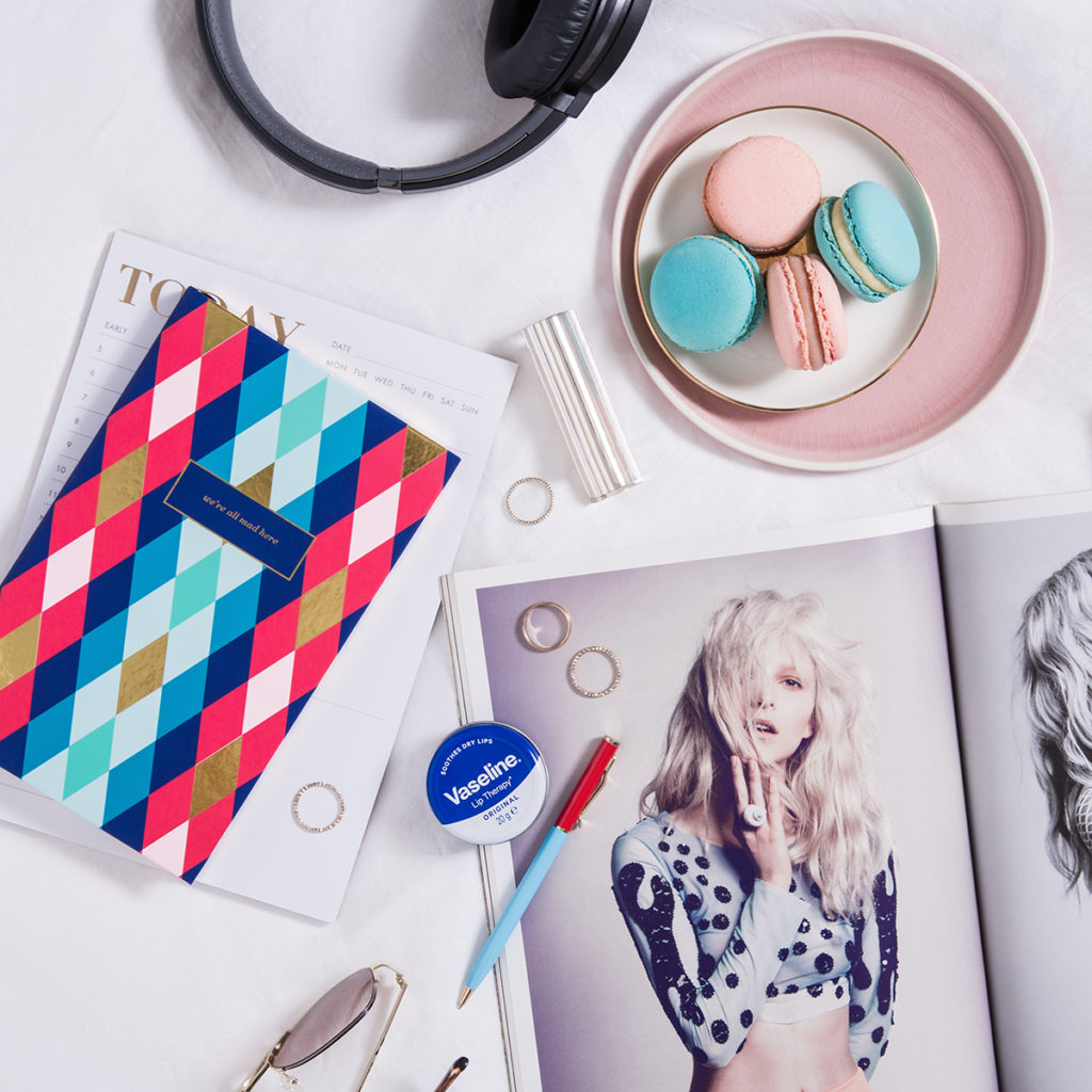
Flatlay shot for Vaseline
Step 6: Stick To A Simple Colour Palette
It helps to stick to a colour palette when choosing your secondary props. That way your props will blend into the background and not jump out to grab the attention. If you’re new to working with colour palettes, stick to only 2-3 colours that go well together. As an added tip: black and white are neutral shades that go well with any colour palette so you can’t go wrong with black or white props.
Step 7: Shoot Your Flatlay
Flatlays are shot from a bird’s eye view so hold your camera directly above the middle of your flatlay. Stand on a chair or ladder if you need to get higher. The goal is to get your camera parallel to your flatlay so the lens is aimed straight down. If you’re using a camera phone, use the square crop mode and turn on your grid to help line up your shot.
Once you’ve got your shot, try shooting a few variations for bonus content. If you’ve spent valuable time and effort to style the perfect flatlay, get more bang for your buck by getting more shots. Shoot your flatlay from a different angle, use a different crop, or swap out a few key props for new ones. I also like to snap some behind the scenes photos to share with my audience. The more content you can get, the better!
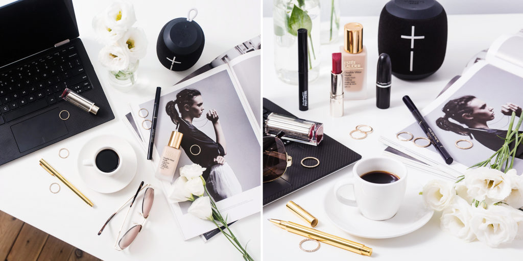
Changing my angle and moving some props gave me an easy second photo from one flatlay

