Strong composition is key when creating scroll-stopping imagery. Learning the rules of composition builds a solid foundation for photographers wanting to design their images for greater impact. But once you learn those rules, how can you best use them to your best advantage?
I’m thrilled to introduce talented artist and illustrator, Georgie St. Clair, as my first guest blogger here on the WSP blog. I’ve been a huge fan of her IG feed @georgiestclair for ages and I’ve learned a lot about composition just from following her feed. Read below to learn her top design rules of composition:
As an artist and illustrator, I use 5 basic design rules of composition to help me create eye catching images for all of the content I create. From animations to design, illustration to photography, I’ll use these 5 basic design rules of composition to create images that really pop.
Much of what I create is used on social media so I’ve included examples of my own Instagram imagery here. Alongside the work of some of my favourite Instagrammers, who inspire me daily.
Rule of Thirds
Use the rule of thirds to create eye catching images. This is a popular design rule but what exactly does it mean?
The Rule of Thirds refers to dividing a picture into thirds, horizontally and vertically. The most important elements of your composition should be placed along the left or right vertical thirds and/or the top and bottom horizontal thirds. Your ‘power points’ are where your lines intersect and where the visual magic can happen


Photo by Nikki Astwood @revisededitionstyle
Negative Space
This is my particular favourite composition design rule. Negative space is all about the empty spaces around objects. It can be used to create minimal or highly creative images such as @DrCuerda’s image below, holding the umbrella against the painted wall

Photo by @drcuerda
Symmetry/Asymmetry
To create balance in an image the placement of objects in relation to each other is very important, by using symmetry or asymmetry in your composition.
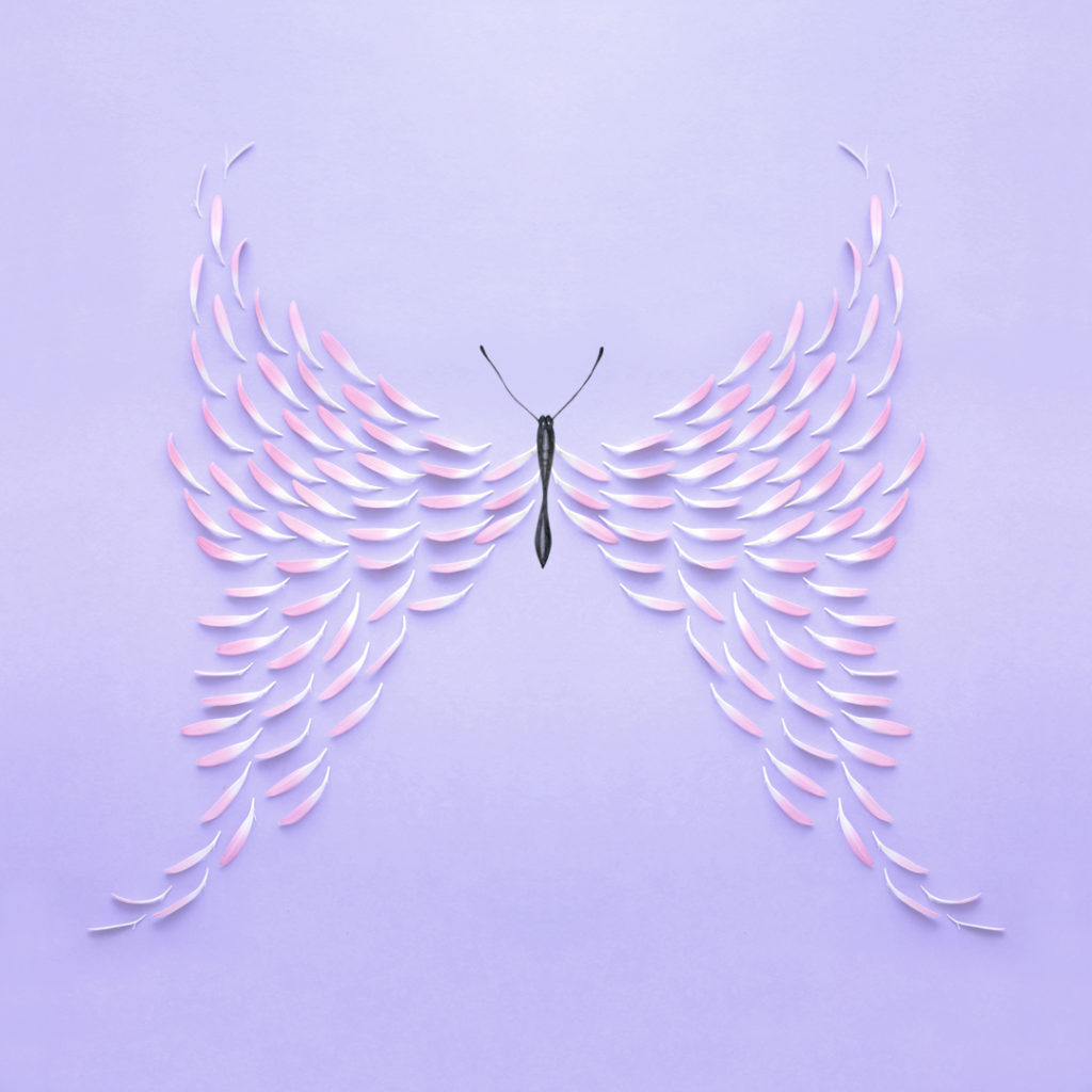
Photo by Georgie St Clair @georgiestclair
Symmetry is achieved when elements are arranged in the same way on both sides of an axis. Symmetry adds a natural balance to a design that is very pleasing to the eye and very easy to achieve in your own imagery. Usually you’ll find the point of interest is placed in the centre of a picture.
Asymmetry is achieved when elements balance due to the contrast in their placement. A simple example would be a large square placed on one side of an axis balanced by a small circle on the other side.
A lovely example of asymmetry is this composition by @HannahArgyle.
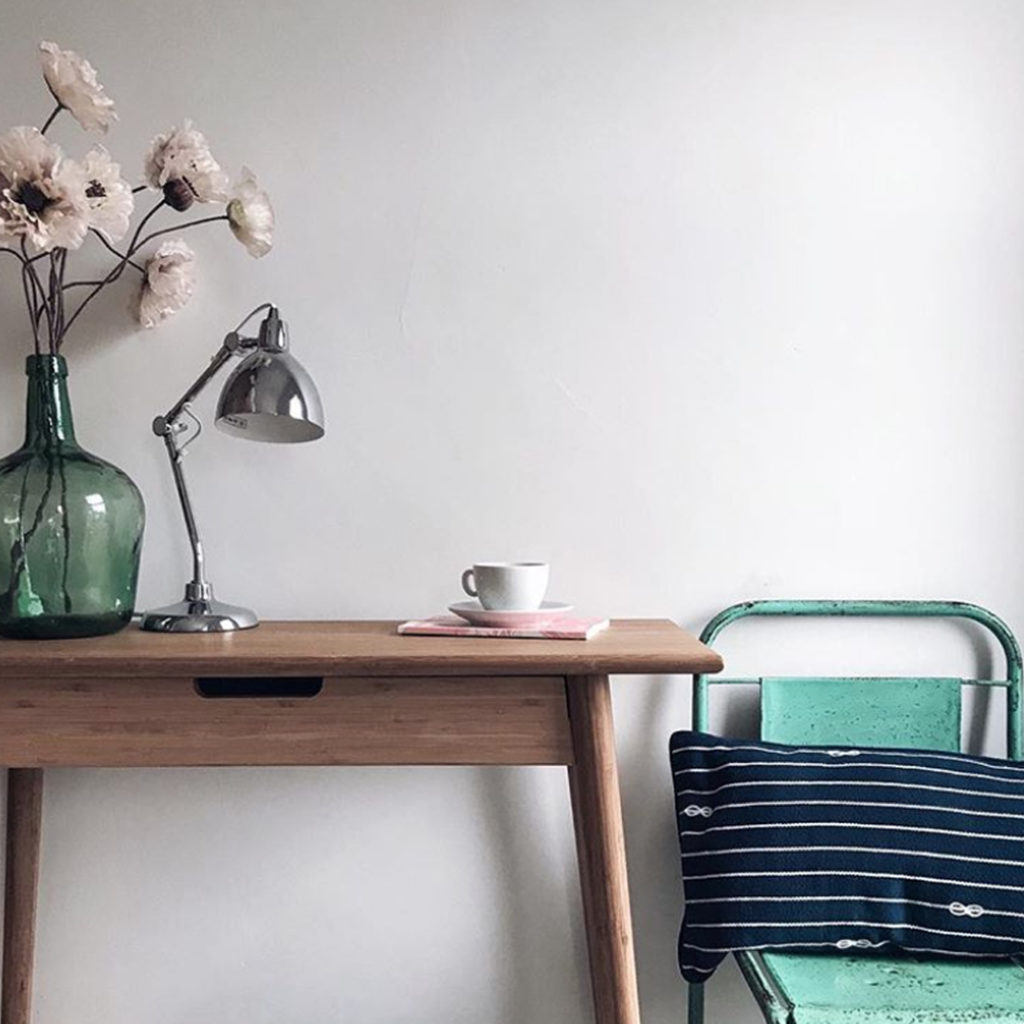
Photo by Hannah Argyle @hannahargyle
Colour
I believe less is always more with colour. By sticking to no more than 3 colours or using a variety of tones from only 1 colour, you’ll make images that really catch the eye.

Photo by Georgie St Clair @georgiestclair
Someone who uses colour brilliantly on her Instagram account is @CarolineSouth so do take a look at her inspiring feed.

Photo by Caroline South @caroline_south
Odd Numbers
Unless you are creating symmetry, stick with odd numbers in your composition. Odd numbers of objects create visual interest. My favourites are 1, 3 and 5. For example, 1 person, 3 pots, 5 (of the same) flowers etc.

Photo by Georgie St Clair @georgiestclair
In the floral paintbrush image above, I’ve included:
1 brush handle, 3 passion flower heads, 5 pops of purple and although not obvious, 5 leaf branches.
As you can see, I’m pretty obsessed with odd numbers!
And Finally…
In all of the image examples above, a variety of the 5 basic design rules of composition have been used. And to great effect.
Once you master the 5 basic design rules of composition, don’t forget you can have fun breaking the rules too. Some of the greatest artists and photographers have learnt the fundamentals and then broken out to make amazing imagery. Have fun and happy creating 🙂
Georgie St Clair | Art & Illustration
Instagram: http://instagram.com/georgiestclair/
Twitter: https://twitter.com/GeorgieStClair
Website: http://georgiestclair.com/


